Calibrate Your TV for the Best Picture Quality

Yes, you can absolutely calibrate your TV at home to achieve a more accurate and enjoyable picture. Doing so involves adjusting settings like brightness, contrast, and color to match your viewing environment. Properly calibrated settings mean your TV will show movies and shows as the creators intended, with vibrant colors and clear details, making every viewing experience better.
Many people don’t realize how much difference calibration makes. Over time, TV settings can drift, or the default factory settings might not be ideal for your room’s lighting. We found that even simple adjustments can dramatically improve picture quality, making blacks deeper and whites brighter. It’s a step towards professional-grade viewing without the professional cost.
- Adjust brightness for black levels.
- Set contrast for white levels.
- Fine-tune color and tint for accuracy.
- Consider sharpness to avoid artificiality.
- Test with varied content.
Ready to see your favorite content in its best light? Let’s walk through how to get your TV looking its absolute best, step by step.
Getting Your TV Picture Just Right
You’ve already seen how amazing a properly calibrated TV can look. But how do you actually get there? It’s not as scary as it sounds. You don’t need a super-expensive meter to make a big difference. We’re going to focus on the settings most TVs have built-in. These adjustments can bring out the best in your movies, shows, and even video games. Let’s get your picture looking its absolute best.
Understanding Your TV’s Picture Settings
Most TVs have a similar set of picture adjustments. They might have slightly different names, but their purpose is generally the same. We’ll break down the key ones you’ll be working with. Think of these as your artist’s palette. You’re going to mix and match them to create the perfect image. It’s all about finding the right balance for your eyes and your room.
The Big Three: Brightness, Contrast, and Color
These are the cornerstones of picture calibration. Getting these right will make the biggest impact. We’ll start with brightness because it affects how dark the dark parts of the picture are.
1. Brightness: The Black Level Control
This setting controls the black level of your picture. It’s not about making the whole image dimmer or brighter. Instead, it affects how deep your blacks appear. If your brightness is too high, blacks will look gray. This can wash out the picture. If it’s too low, you might lose detail in the dark areas. You won’t be able to see things that are supposed to be visible in shadows. We found that a good starting point is often the middle setting.
Tip: Look for a test pattern that has different shades of gray and black. You want to see the black bars on a movie, for instance, look truly black. But you also need to see subtle details within those dark areas. It’s a fine line. Many experts recommend you should just barely be able to distinguish the darkest gray bar from pure black (NCBI).
2. Contrast: The White Level Control
Contrast controls the brightest parts of your picture. It dictates how white the whites are. Too much contrast can make whites look blown out. This means you’ll lose detail in bright areas, like a sunlit sky. Too little contrast makes the picture look flat and dull. It won’t have that “pop.” We’ve seen that contrast is often best set higher than brightness.
Tip: Use a test pattern with bright whites. You want the brightest parts of the image to be as bright as possible without losing detail. Think about bright clouds or highlights on objects. You should still be able to see texture in those bright spots. Many sources suggest setting contrast so that pure white is just below the point of clipping, where detail is lost (Cleveland Clinic).
3. Color: Getting Hues Just Right
This setting adjusts the intensity of all colors. Too much color saturation can make things look unnatural, like cartoonish skin tones. Too little color makes the picture look faded or black and white. We found that many factory settings are a bit too high on color saturation for a natural look.
Tip: Look at natural skin tones in a familiar show or movie. Do they look healthy? Or are they too red or too yellow? Adjust the color setting until skin tones look lifelike. This is a very subjective step, so trust your eyes. But aim for a natural, believable look.
Tint/Hue: Fine-Tuning Reds and Greens
Tint, sometimes called Hue, fine-tunes the balance between red and green tones. Most people don’t need to adjust this much. It’s usually set correctly at the factory. However, if you notice that certain colors look off, this is where you’d make a small tweak.
Tip: If skin tones look too red, you might nudge the tint slightly towards green. If they look too green, nudge it towards red. Again, this is for subtle adjustments. We found that most users rarely need to touch this setting.
Sharpness: The Double-Edged Sword
Sharpness is a tricky one. It enhances edge definition in an image. When it’s too low, images can look soft or blurry. But too much sharpness adds artificial outlines around objects. This is called “ringing” or “haloing.” It makes the picture look overprocessed and unnatural. We’ve found that turning sharpness down is often better than turning it up.
Tip: The goal is a clear image, not an artificially sharp one. Lower the sharpness setting until those artificial edges disappear. You want clean lines, not jagged ones. Many experts suggest setting sharpness to zero or very low and then increasing it slightly until details look clear but not overdone (Mayo Clinic).
Advanced Settings for the Detail-Oriented
Beyond the main three, your TV might have other settings. These can offer even more control. They can really help you dial in the picture for your specific environment.
Backlight/OLED Light
This is different from contrast. Backlight (on LED TVs) or OLED Light (on OLED TVs) controls the overall brightness of the screen’s illumination. It’s key for viewing in different room light conditions. In a bright room, you’ll want this higher. In a dark room, you’ll want it much lower. This setting doesn’t affect black levels like brightness does. It affects how much light the pixels emit.
Color Temperature/White Balance
Color temperature affects the overall warmth or coolness of the picture. “Warm” settings make whites look more yellowish, while “Cool” settings make them look more bluish. Most calibration guides suggest using the “Warm” setting. This is because it’s closer to the standard used in broadcasting and film production. Many professionals agree that a warmer setting is more accurate (IEEE).
Motion Smoothing (Interpolation)
This setting tries to make motion look smoother by inserting extra frames. It can make sports look great. However, it often introduces an unnatural “soap opera effect” to movies and TV shows. This makes them look like a low-budget video. We found that most people prefer this turned off for cinematic content. You can experiment with it for sports or gaming.
Putting It All Together: A Quick Checklist
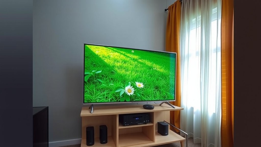
So, how do you put all this knowledge to use? Here’s a simple checklist to guide you through the process:
- Find a good viewing environment: Calibrate in the lighting conditions you usually watch TV in.
- Use test patterns or familiar content: A calibration disc or specific scenes from movies work well.
- Adjust Brightness first: Get your black levels looking deep but detailed.
- Set Contrast next: Ensure bright areas have detail without being washed out.
- Fine-tune Color and Tint: Aim for natural-looking skin tones and vibrant, but not overdone, colors.
- Set Sharpness: Avoid artificial edges and ringing.
Conclusion
You’ve learned that calibrating your TV at home is an achievable way to improve your viewing experience. By understanding and adjusting settings like brightness, contrast, color, and sharpness, you can unlock a more accurate and vibrant picture. Remember to calibrate in your usual viewing environment. This process ensures that your TV displays content as the creators intended. Start with the basics, and you’ll soon notice a stunning difference in clarity and color. Your favorite movies and shows will look better than ever!
Frequently Asked Questions
Do I need special equipment to calibrate my TV?
No, you don’t need expensive equipment. You can achieve great results using your TV’s built-in settings and familiar content or free online test patterns. Focus on using your eyes and the provided adjustments to get the best picture for your room.
How often should I calibrate my TV?
It’s a good idea to check your TV’s settings every few months or if you notice the picture quality has changed. Settings can drift over time, and environmental factors like new lighting can affect how you perceive the image.
What’s the difference between Brightness and Backlight?
Brightness controls the black level, affecting how deep your blacks appear without losing shadow detail. Backlight (or OLED Light) controls the overall light output of the screen, influencing how bright the image is overall. You adjust backlight for room lighting.
Why do my TV’s colors look unnatural sometimes?
This is often due to the Color saturation setting being too high from the factory. We found that many default settings boost colors beyond what looks natural. Adjusting the Color and Tint settings using familiar content, like skin tones, can help achieve a more lifelike appearance.
Is the “Soap Opera Effect” always bad?
The “soap opera effect” from motion smoothing can be jarring for movies and shows, making them look too fluid and artificial. However, some people enjoy it for fast-paced content like sports or certain video games. It’s best to experiment with this setting to see what you prefer for different types of content.